Shopify's Responsive Images (RIMG for short) system balances page speed optimization with high-quality image display. It's built into Shopify's `image_tag` and `image_url` Liquid filters, which every Pixel Union theme uses, and there are some details to keep in mind when adding images to your theme.
- How RIMG works
- What dimensions should I be using for RIMG?
- Image cropping across different device sizes
- Recommendations for using RIMG
How RIMG works
Shopify's `image_tag` filter automatically generates a `srcset` for every image in your theme a set of resized versions Shopify's CDN creates from the original file you upload. Depending on the size needed for a device or browser window, the browser picks the smallest version that still looks sharp, rather than downloading the full-size original every time.
The larger the image, the more time it takes to load. A customer browsing on an iPhone doesn't need a 2800 x 1000px image delivered at full size the responsive images system automatically serves a smaller version to cut down on load time, without you needing to manually create or upload multiple sizes yourself.
What dimensions should I be using for RIMG?
ince the system generates smaller versions automatically, upload the largest, highest-quality version of an image you have available. There's no need to pre-shrink or compress images before uploading doing so only limits the quality of the smaller versions Shopify generates.
That being said, dimensions are not as important as proportions with RIMG. The proportions of an image are known as the aspect ratio.
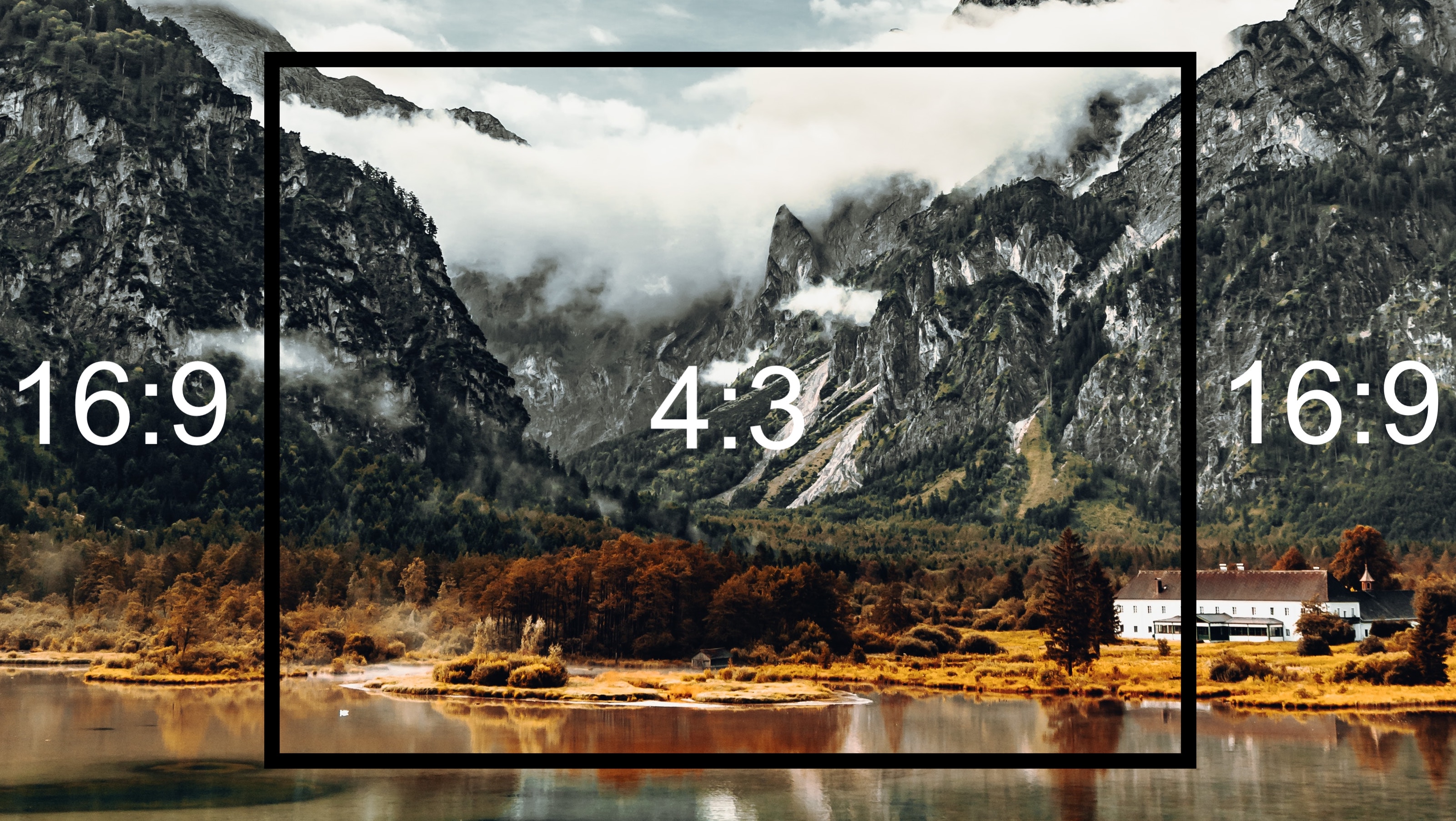
A practical example of this would be from television history. Television shows were once filmed in a 4:3 aspect ratio until recent decades. Now they are largely 16:9.
With aspect ratios, the first number represents the width and the second represents the height. For example, if you have an image that is 2000 x 1600px, this would be a 5:4 ratio. If the theme feature requires a 4:3 aspect ratio, you could crop the image to 2000 x 1500px (both divided by 400) to better fit the container for each device display.
Use this aspect ratio calculator to convert image dimensions into aspect ratios. This is especially helpful when specific aspect ratios are listed in the theme editor.
Image cropping across different device sizes
Although the RIMG system is responsive to all devices and window sizes, it would be unrealistic to expect every edge and corner to be fully visible in each case. To avoid blank spaces or visible backgrounds, images expand or 'bleed' to fit their container.
To get a sense of how diverse screen dimensions are, check out this spreadsheet created by TypeCode: Device screen sizes
Considering this behavior, avoid images that have important details or text near the edges, and focus the content on the center of the image. Generally, this is a best practice for image use and encouraged by Shopify.
Since the system generates smaller versions automatically, upload the largest, highest-quality version of an image you have available. There's no need to pre-shrink or compress images before uploading doing so only limits the quality of the smaller versions Shopify generates.
Image format: why WebP matters
Shopify recommends **WebP** as the default format for images uploaded to your store. WebP files are typically much smaller than JPEG or PNG at the same visual quality, which means faster page loads on top of the savings from responsive sizing. If your source images are currently JPEG or PNG, consider converting to WebP before uploading Shopify will still generate the full range of responsive sizes from it.
Recommendations for using RIMG
To summarize, here are some key takeaways for using RIMG:
- Start with the highest quality images you have and use these for each image feature. Images don't need to be compressed or reduced in quality to increase page speed with RIMG.
- Dimensions don't have to be specific pixel values—the aspect ratio is a better reference for fitting images into the desired containers.
- Avoid using images that have details or information in the margins and corners. There is always the potential for image cropping in order to fit every container. Focus mainly on the center of the image for content.
Can RIMG be disabled?
Responsive image delivery is a required feature for all themes sold in the Shopify Theme Store. It may be technically possible to disable it, but doing so would come at a real cost to page speed, and would disqualify the theme from Pixel Union's support services.