A collection page displays all of the products in a given collection. Build your collections from within your Shopify admin, then customize theme features and settings with the theme editor.
Use the theme editor to access collection page settings, show collection image, show description, enable sorting, enable filtering, and adjust product item settings for the collection pages in Grid.
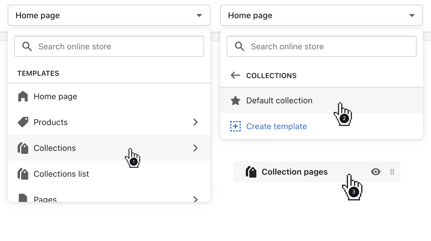
Access collection page settings
Customize your Collection pages by selecting opening Collections then Default collection with the page selector.
Creating additional templates with the theme editor
Show collection image
Enable Show collection image to display the Collection image at the top of the page. To set this up, go to Collections in the Products admin, then upload your collection image(s).
Show description
This option will pull a collection description onto your collection pages. This text content can be added through the Collections portion of the Products admin.
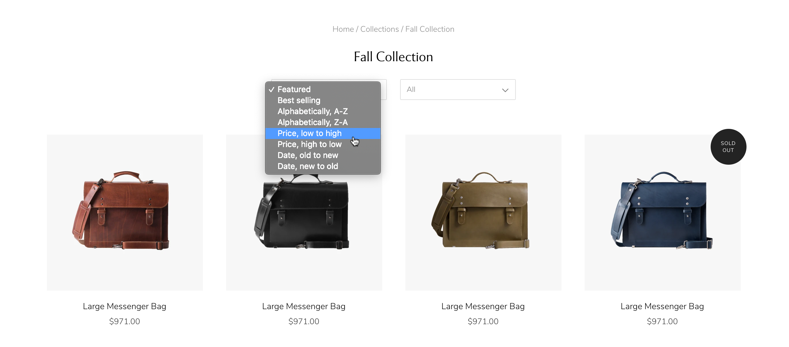
Enable sorting
This feature allows customers to sort products in a different order than they appear by default (e.g. Featured, Price: Low to High, Price: High to Low, A-Z, Newest to Oldest, etc.).
Enable filtering
With the latest release of Grid, merchants can use the platform-based faceted filtering system.
Open your collection page template through the page selector, open Collection pages in the sidebar, then click to Enable filtering.
Shopify: How to set up filters
Select a layout option
Grid's Collection pages come with two Layout options: Default and Masonry. Default will display products in uniform rows and Masonry will display them in an offset collage style, similar to the Masonry section styling on the home page.
Default layout controls
Specify the Rows (2 to 12) and Products per row (2, 3, or 4) that display on your collection pages using the labeled sliders.
Adjust product item settings
Enable overlay/hover interaction
Use this dropdown menu to select what happens when a customer hovers their mouse cursor over a product. The options are:
- Quick shop (which will open a modal with the product details and an add-to-cart button)
- Show secondary image (which will flip the image to an alternate view of the product)
- Stock level indicator (which will show a warning when stock is below a certain level)
- None
If Stock level indicator is enabled, you can specify the trigger quantity in the slider below.
Sale and sold out badges
You can also choose to Use icons for 'on sale' / 'sold out' badges on products in your collections by checking that option. The first option will display text badges, however, you can also Use icons for product item badges by checking that option.